
Softness of an image can sometimes be more important than sharpness. I’m sure many of you know this already but the concept wasn’t always one I accepted easily. My early work was, for many years, about squeezing every ounce of sharpness and tonality out of my films as possible for maximum impact. But, slowly I learned that there’s a time when softness is best.
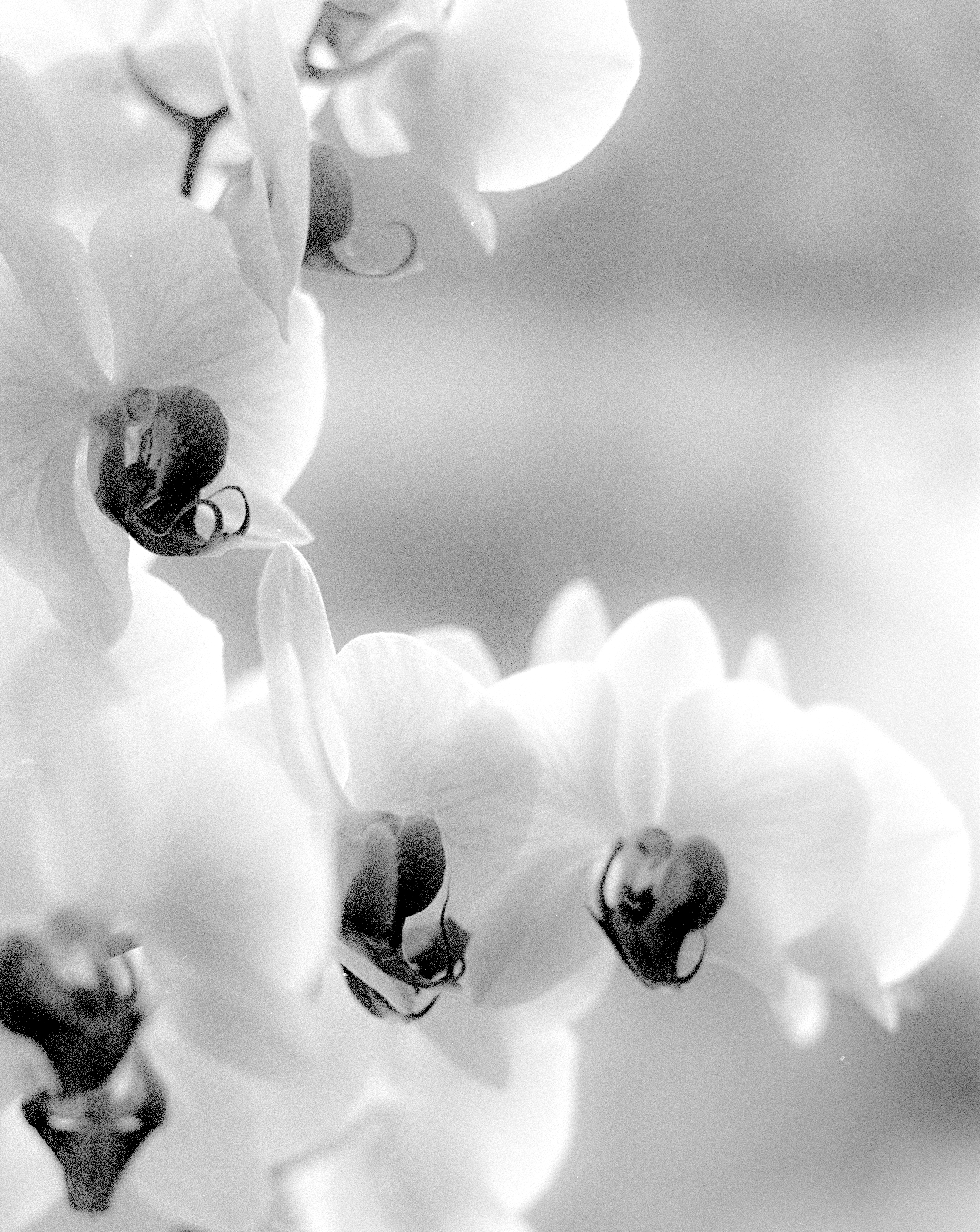
The Orchids
The most obvious example is with portraits. To me they will often look better when slightly soft. This hides a little detail in the skin and covers up some blemishes. I’m sure we’ve all seen those Hollywood black and white films where the beautiful actress is always shot with a soft filter (or a piece of a woman’s nylons) over the lens. I also find Some still life can look better too when slightly soft such as with The Orchids, above.
Location
The flowers were kindly given after my mother’s funeral last year. They are quite beautiful and I wanted to capture them on film before they deteriorated. They are pure white with that spot of black in the centre - quite delicate in the way they hang on the stem. To capture this vulnarability and beauty was my work to make this image.
The first thing to think about was the lighting. I wanted to show the flowers at their best and my initial idea was to have a dark background. This, I thought, would make the flowers stand out. But when I placed them against a dark backdrop, I could see it took something away from their gentle nature. They looked stark, defined, and harsh, not what I wanted. Maybe I was being emotional, because of my mother’s recent death, but I felt somehow that a light background would be more suitable, more gentle, more peaceful. When I placed them against a mottled white background the feel of the photograph changed; now it felt right.
The next decision was the film. Ilford FP4 Plus is my go to film, it,s just a great all-rounder. The other films I use are PAN F Plus and sometimes HP5 Plus. All three are excellent films but FP4 Plus has a wonderful sharpness with a classic analog film look. I find Delta 100 very good too but it looks a little clinical to my eyes, a bit digital. The tonality of FP4 Plus is also really full and rich. This was the film I’d use.
I set up my Pentax MX camera and chose the 50mm f1.4 lens. This would give me the soft bokeh I wanted. At the time it was one of my best ‘bokeh’ lenses but I’ve since obtained an older Pentax 55mm 1.8 which betters it a little. The older design of this standard 55mm lens seems to optimise the bokeh while keeping a lovely sharpness to the image. If you have a Pentax this is definitely a lens I’d recommend in the standard range.
Metering
Photographing high-tone subjects can be a challenge but it shouldn’t be if we have tested our film and developer combination. From our testing for personal EI and development time we know the true iso of the film to set on our meter - therefore allowing us to place any zone accurately on our paper print. With this information I metered the lightest part of the flowers and place them on zone 8. Zone 8 is white with a little detail, perfect for a flower like this.
Development
My planning needed one more decision. Which developer to use.
Many of the developers I use are acutance developers. They make my photographs sharper. These are FX 55, FX 15, Rodinal, and Pyrocat. They all have their own look and work well with different photographs but there’s one developer I use that isn’t about sharpness but more about tonality and that’s D23. It’s soft, pleasing tonality works very well with this subject as it does with portraits and the many still life subjects I’ve photographed in the past. I used the replenished version because it adds a little more sharpness but without increasing local contrast and fine detail.
The Orchids print exactly as I envisaged, soft and gentle, a lasting memory of a very special person in my life.
Edit: Typo